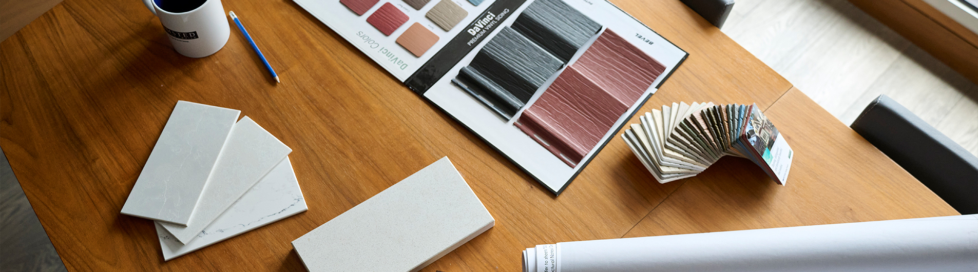
Your 2026 Colours of the Year Guide
It’s the most colourful time of year, that wonderful time when paint brands tell us what shades we’ll be swooning over next. And if 2025 was all about calm neutrals and safe choices, 2026 is ready to shake things up.
Think smoky greens, cozy browns, and rich jewel tones that turn “neutral” into next level. After years of pared-back minimalism, colour is officially reclaiming its place, warm, bold, and full of feeling.
Our Design Team is especially excited about this year’s lineup. These shades are all about depth, texture, and personal expression. Whether you’re drawn to timeless neutrals or ready to dive into moodier hues, there’s a colour here to inspire your next transformation.
Here’s the roundup everyone’s talking about — and the shades that might inspire your next refresh.
Behr: Hidden Gem

The vibe: Smoky jade with a touch of mystery, calm, refined, and full of quiet depth.
Why we love it: Hidden Gem is more than just a pretty blue-green; it adds instant complexity and depth. This is a versatile, layered color that adds sophistication without heaviness.
Perfect for: Accent walls that draw you in, cabinetry that feels custom, or colour-drenched rooms where every surface tells a story.
Valspar: Warm Eucalyptus

The vibe: Calming, sun-kissed green with warm undertones — nature’s version of a deep breath.
Why we love it: Warm Eucalyptus is earthy and restorative, blurring the line between indoor and outdoor living.
Perfect for: Breezy living rooms, spa-like bathrooms, or multi-purpose spaces that need a sense of calm. Pair it with ceramics, raw wood, and sandy gold accents for an organic, grounded finish.
Sherwin-Williams: Universal Khaki
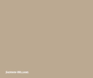
The vibe: A midtone neutral with natural warmth.
Why we love it: Universal Khaki is the perfect bridge between minimalism and character, while remaining flexible enough to mix with bold textures, layered tones, and modern materials. It’s earthy but elevated.
Perfect for: Open living spaces, kitchens with mixed materials, or anywhere you want a soft neutral that grounds the design without fading into the background.
Glidden: Warm Mahogany

The vibe: A deep, rich red-brown. It feels both bold and endlessly warm.
Why we love it: It creates immediate mood and personality without being loud. Warm Mahogany pairs well with diverse textures and materials, such as aged leather or velvet upholstery, making the space feel personal and anchored.
Perfect for: Dining rooms that glow at golden hour, cozy dens, or creative corners that celebrate comfort and individuality.
Sico: Boreal Forest
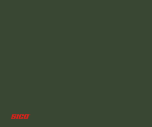
The vibe: Deep, restorative green inspired by Canada’s vast northern wilderness.
Why we love it: Boreal Forest instantly brings the calm of nature indoors. This deep hue adds significant strength and depth to a space without overwhelming it.
Perfect for: Canadian-inspired interiors that celebrate texture and balance. Try it with stained or coloured glass, polished nickel, or glossy finishes to add lightness and movement to its moody base.
Benjamin Moore: Silhouette
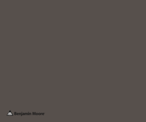
The vibe: Sophisticated, smoky, and endlessly elegant, a blend of burnt umber and soft charcoal.
Why we love it: Silhouette delivers quiet drama and polish to walls. Subtle espresso undertones add warmth, giving the color a look of refined tailoring and timeless style.
Perfect for: Living rooms, hallways, or dining spaces where you want timeless style with just the right hint of drama.
The Takeaway: Moody and Rich Colours are In.
The 2026 palette confirms a shift. We’re trading stark whites for story, colours that feel lived-in, layered, and full of personality. From bold accent walls to subtle tone-on-tone palettes, the 2026 hues prove that warmth and character are back (and here to stay).
Our Design Team are experts at helping homeowners find the right balance, guiding you through colour choices that complement your space, your finishes, and your lifestyle.
So, if you’re feeling inspired but not sure where to start, our team’s here to help.