The cooler weather has us naturally thinking about being inside. In his latest appearance on CTV News at Noon, Amsted President Steve Barkhouse shares a main-floor renovation that creates open and warm spaces for the homeowners to come together as a family, while also highlighting the before and afters of their spruced-up exterior as inspiration for your home.
(In part 2, Steve shares our handy seasonal maintenance checklist and runs through some of the key fall prep and winterizing items you don’t want to miss.)
Bringing the family inside
As with many older homes we’re enlisted to renovate, this home featured divided spaces and individual use rooms.
The family wanted to retain all of the functionality they had before, but open up their home so it didn’t feel as boxy and separated. By adding two small additions to make the garage flush on the front and rear of the home, we were able to gain enough space to:
- maintain their formal living and dining rooms,
- retain a cozy family room,
- expand the kitchen and create a welcoming space,
- add a mudroom,
- and spruce up the outside.
Foyer
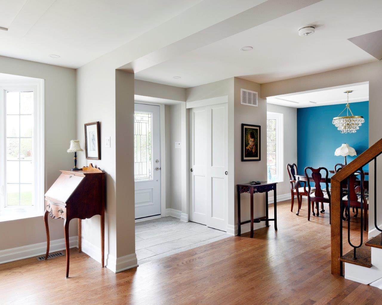
The main entrance was dark, narrow and enclosed. All doors opened into the space, which made moving around in the space challenging. It was not practical for everyday family use, nor was it a welcoming space for guests.
We started by removing most of the walls. We widened the space slightly, shifting the new wall over. Since this would be primarily a guest entrance now, with a new mudroom at the rear for the family, we were also able to reduce the size of the closet. Now the space is functional and practical.
Selections also made a big difference here. Light colours in paint, trim and tile keep the space bright but also help create the look of a designated entryway. Sliding doors instead of the original bi-fold mean the doors are not intruding on the space. And light is added to what had been a dark space with a new door with glass insert and a pot light above.
Dining room
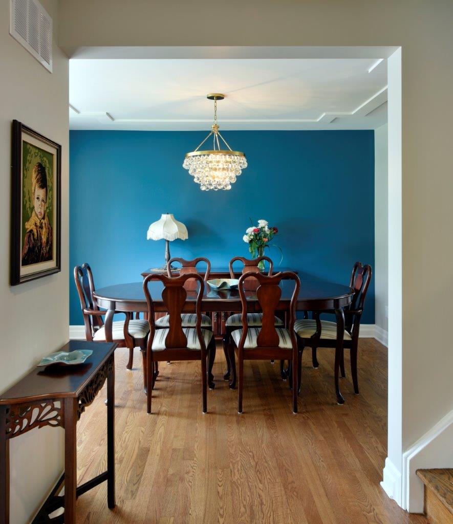
We often see people remove this room in favour of casual eating areas, but in this case the homeowners wanted to keep theirs for gatherings. Painting one wall in teal and adding a bold chandelier make this space stand out, especially since the main floor has been opened up.
Living room
On the opposite side of the entrance was an enclosed living room. A dividing wall ran the entire length of the room — with the only entrance a doorway beside the stairs — the space was not often used.
We removed nearly the entire length of the wall, adding tremendously to its use. The new space is not incredibly different, but it feels updated, fresh and inviting.
We added ceiling details for visual appeal; new hardwood runs throughout, adding warmth to lighten the space; and the homeowners commissioned a beautiful cement fireplace, all of which create a welcoming place to sit by the fire and chat.
Kitchen
The old kitchen was dated, and while the original footprint wasn’t bad, the homeowners were looking for more. They also wanted cohesion between the kitchen and dining room.
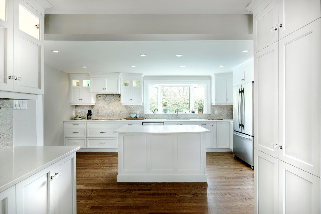
The new kitchen is a chef’s dream that has also become a natural gathering place! There’s a convenient, widened pass-through to the dining room; this pantry and butlers’ kitchen with countertop make last-minute prep easy while providing plenty of storage. And the kitchen now opens onto the large, expanded space.
 All appliances have been moved to the perimeter. With the range moved from the island, it allows the island to be designated prep space and seating for the family.
Traditional white shaker kitchen cabinets with lit glass uppers showcase special pieces and the hexagonal, patterned tiles on the backsplash add dimension and a pop of personality.
Exterior
While this is obviously a complete overhaul of the exterior façade, it’s amazing what a little consideration for the outside of your home can do for your investment.
We maintained the lines of the existing home, while updating the selections. The white siding was replaced with grey and the shutters were removed. New stonework on the lower portion upgrades the look from the white brick.
The window trim was painted white to make the beautiful bay windows stand out, while new landscaping allows the home itself to shine through.
The whole exterior now ties together as a beautiful place that the family can’t wait to come home to.


