As the days get shorter and we start spending more of our evenings inside, it’s a good time to remind you just how important lighting can be in your home. Amsted President Steve Barkhouse explains in our latest appearance on CTV News at Noon, while sharing the before and afters of a recent renovation.
Research shows that an adequate amount of light improves mood and energy levels, while poor lighting contributes to depression and other deficiencies in the body. The amount and type of lighting directly affect concentration, appetite, mood, and other aspects of daily life.
But lighting is an area that can be a big question mark for many homeowners.
While it’s easy to visualize furniture, paint colours and appliances, lighting is more difficult to visualize and more complicated. A lamp or fixture might look great in a store, but it’s often difficult to imagine how the light will work in a particular space.
And not only fixtures, but what about bulb type, colour, and all of the other variables that influence lighting decisions?
We’ll go through all of that, first with a beautiful whole-home transformation that was thoughtfully designed to incorporate natural and well-placed artificial lighting from our friends at Marchand Electric, and then in part 2 by exploring some of the common issues we see about lighting and discussing some of the newest trends you can try out in your home.
Adding light through thoughtful design
Our clients came to us looking for light and space for their family. The main floor was dark and lacked practicality due to a divided layout. At the same time, the second floor provided the number of bedrooms they needed, but they were small and all family members had to share a single bathroom.
We tackled the challenges through a two-storey addition and floor plan redesign. We removed nearly all dividing walls on the main floor for open-concept living and improved lighting, entertaining and functionality throughout. Upstairs, the added space meant we could expand bedrooms and create a new ensuite for the parents.
Let’s take a walk through the home.
Entrance before:
The entryway was small and closed off. A narrow hallway led to the rest of the home, including a side entrance. Beyond the door there was a small area with hooks for jackets, etc. The space felt cluttered immediately upon entering.
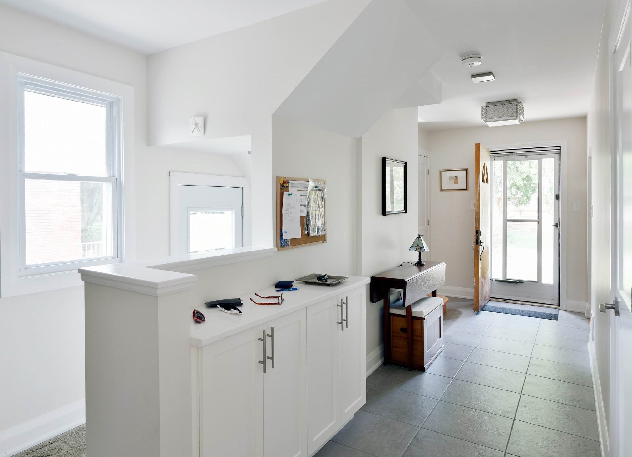
Entrance after:
Now there is a welcoming foyer and expanded hallway. A closet at the entrance allows items to be tucked away and a half wall adds to the openness in the space while providing some separation for the side entrance.
A new countertop and added cupboards create a landing zone and storage, while right behind this photo a bench and hooks act as a mudroom that is easily accessed from both doors.
Note the square flush-mount light between the smoke detector and the front door light fixture that is both stylish and functional. These can be found locally at Marchand Electric, and are shown in Part 2. (link here once posted)
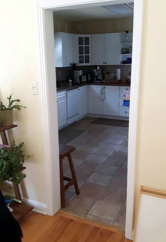
Kitchen before:
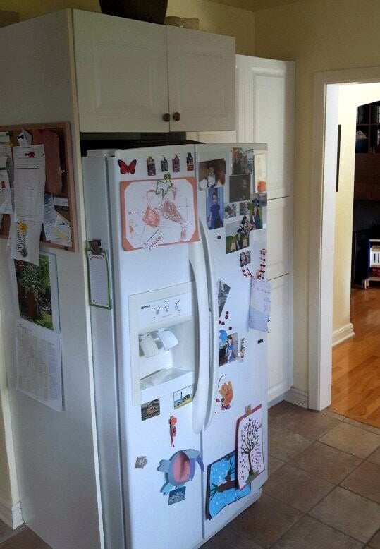
The kitchen was dated and dark with small doorways into and out of the space. It was a typical design for the age of home, it’s just not how we choose to live now. It also suffered from wasted space in the centre of the room.
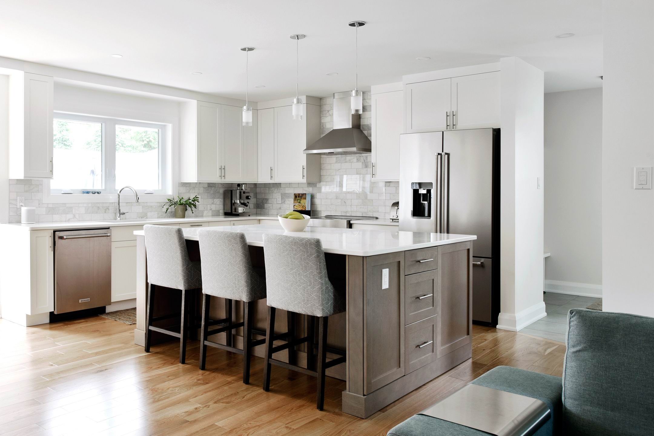
Kitchen after:
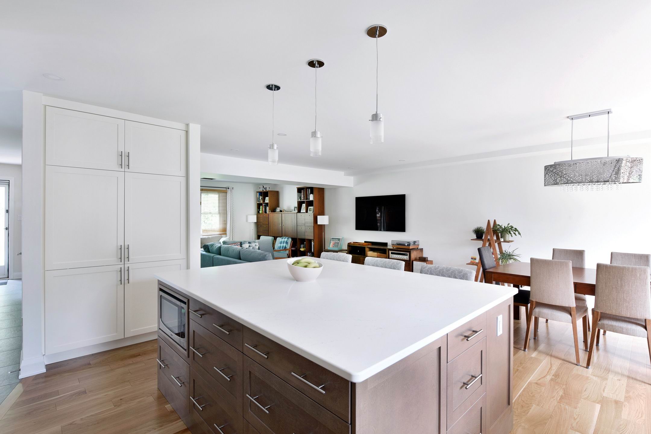
Now the kitchen meets the needs of today’s homeowners. The oversized island provides storage, a place for family to gather and ample prep space.
When it comes to the lighting, chrome and glass pendant lights match the appliances and backsplash, and pot lights add overall function and task lighting.
The kitchen is now bright and open.
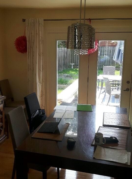
Dining room before:
You may have noticed in the kitchen before photo how a wall separated the kitchen and dining room, keeping the dining room space closed and dark. While doors offer some light out onto the backyard, not much makes it through.
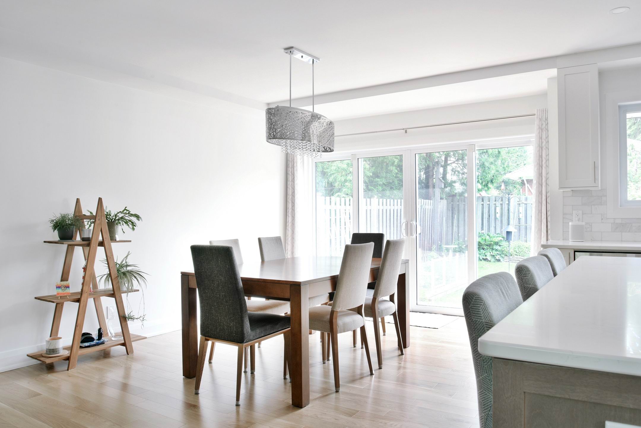
But note the chandelier. The owners had recently purchased it and wanted to maintain it as a dining room feature.
Dining room after:
The new dining room space is bright, open and airy. Removing the walls allows for casual dining for family or seamless entertaining when needed.
Double sliding glass doors flood the space with natural light and towards the end of the project we reinstalled the light fixture, once the furniture placement was set.
Divided rooms before:
This shot of the kitchen and a small pantry, which backed onto the living room, further showcases the divided layout of the home.
Open concept after:
With an open-concept floor plan the homeowners can take advantage of all of the natural light coming from either end of the home, as well as a more natural flow to their living spaces that greatly improves functionality (note the new, expanded pantry!).
Along with all the natural light, there are seamless pot lights throughout and matching chrome fixtures and hardware. The result is convenient, comfortable living!
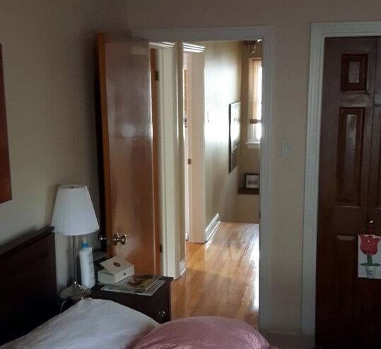
Upstairs hallway before:
The second floor had a small landing with the home’s three bedrooms and bathrooms off the single hallway.
Upstairs hallway after:
In order to fit two similar-sized bedrooms across the back of the addition, the hall becomes filled with doors that offer no lighting. To bring in natural light, we installed a pair of solar tubes — that’s the large white circle of light in the ceiling. Solar tubes capture and reflect light down the tube to increase the amount of natural light in a space without having to add a window or skylight.
The new bedrooms:
The kids’ bedrooms are mirror images and now split the back of the home. Each has two large windows that provide beautiful natural light. They also feature a ceiling-mounted pendant light in a style fitting to each child — soft and delicate for their daughter’s serene bedroom and a unique airplane light fixture in the other that injects fun and youthfulness in the space.
These rooms showcase how even a simple choice in lighting can help personalize a space and create a room or home that is truly “yours”.
More on lighting
Check out part 2 of our CTV appearance on lighting, where we answer common questions we get about lighting and discuss some of the newest trends you can try out in your home with examples from our friends at Marchand Electric.


