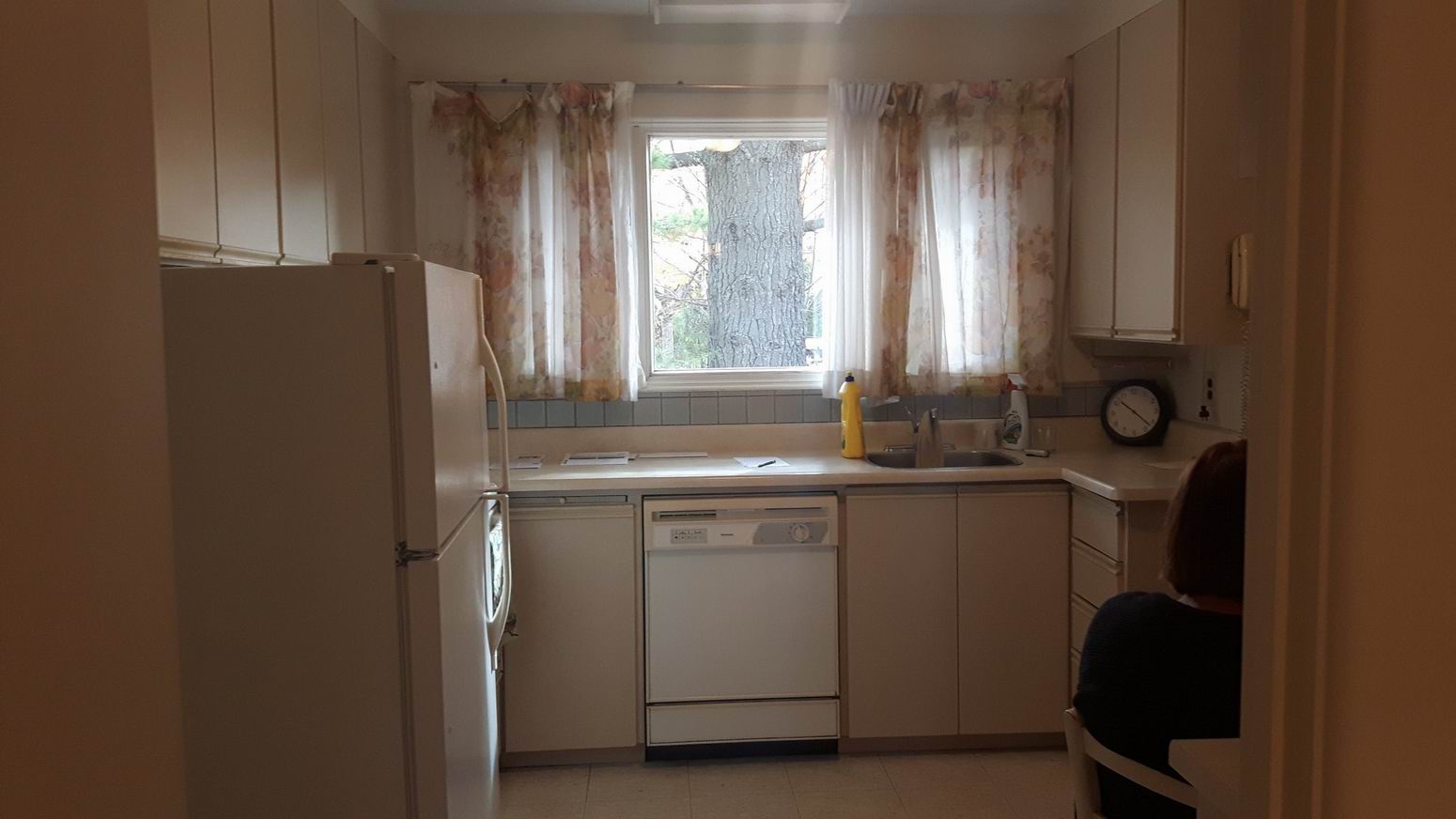
As is often the case with our clients’ home renovation goals, this project was an example of reimagining a dated, choppy layout and finding ways to make the space more functional, all while respecting the home’s traditional charm. We’re thrilled that our efforts have earned two nominations in the Greater Ottawa Home Builders’ Association Housing Design Awards!
This renovation is all about maximizing space and light. The clients wanted a classic and timeless look to their home, which had not been renovated since 1986, says designer Greg Simpson. They also wanted the design to both pay homage to their Rockcliffe Village neighbourhood and incorporate their more contemporary tastes.
In this case, the living room, dining room and kitchen did not need to change location, they simply needed to be better designed. Walls came down for a more open concept. Happily, we were able to do so — and reconfigure plumbing and electrical — without any bulkheads.
Overall, the design has a traditional feel with some modern twists to keep the space looking timeless for many years to come.
Here’s a closer look at what we did.
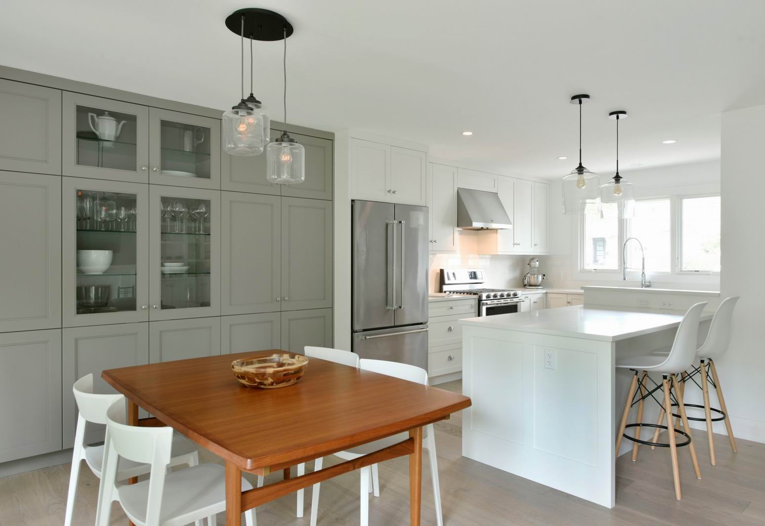
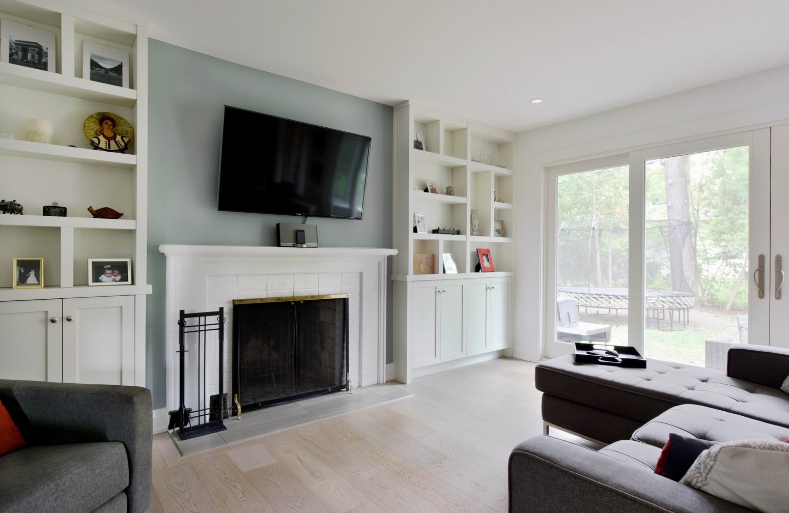
Ample storage all through the space is the highlight of this renovation. There are cabinets across the main wall of the kitchen and dining area, plus cabinets and shelves in the living area. This combination of closed storage and custom shelves provides space for toys to be neatly tucked away while family photos and special trinkets can be on display.
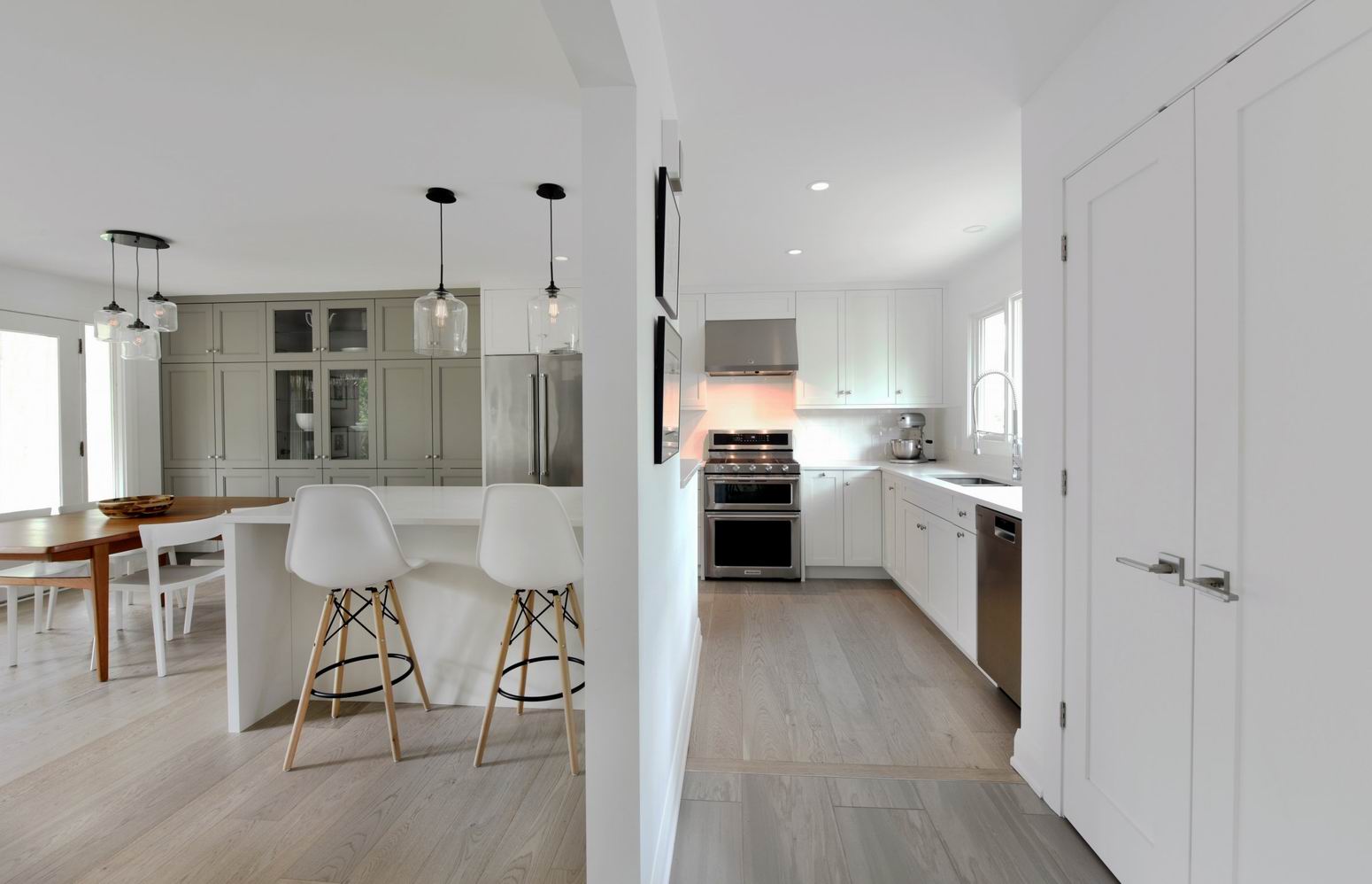
The consistency of clean lines and a bright traditional design make the kitchen, dining room and living room feel like a well-organized open-concept space. These areas make up the main floor and tie in with the style and colours of the rest of the home.
This went from being a compartmentalized main floor into an open floor plan with a seamless transition between spaces.
For the cabinetry, we kept it simple and classic by pairing white cabinets with subway tiles. We used Edison bulbs for all the fixtures to retain a traditional feel to the space.
The island (bottom right) provides extra storage, seating and separation from the food prep area. Ample drawers, as well as a built-in microwave, keep all the essentials organized and easy to reach.
White shaker cabinets, backsplash and quartz countertop produce a bright, open kitchen that flows into the dining and living areas. The cabinets continue into the dining space from the kitchen, transitioning to grey, while the cabinets around the fireplace match the kitchen.
The homeowners had an existing pendant from their last home that they wanted fully incorporated into this new space. All the kitchen and living room lighting fixtures were matched to the dining room pendant.
The living room utilizes lost space under the upper level and custom built-ins flank the wood-burning fireplace, which follows the traditional feel of the space. The offset shelving was added in lieu of full-width shelves to draw the eye to the shelving and create some interest to a previously stark wall.
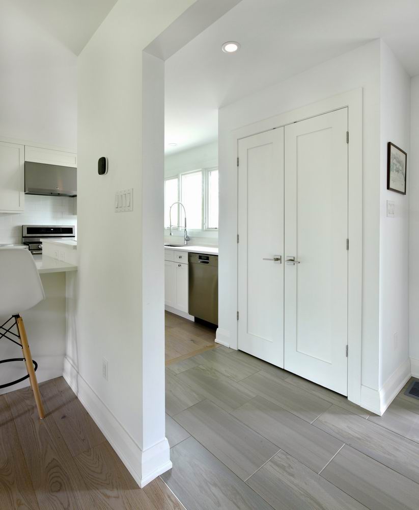
The floors were done in a brushed/matte finish to hide wear and tear from both their young child and from minor scratches and dings from dropping pans in the kitchen. We matched the floor with a stone-look tile to create an inviting, durable entry to the house.
Cabinet accessories such as pull-out garbage bins and spice racks and a hidden tip-out tray at the sink for hiding sponges and soap contribute maximum functionality in the kitchen.
As well, the redesign allowed for a bright new window above the sink and sliding doors (not shown) out to the beautiful backyard.
This way, not only was storage space maximized, but natural light was brought into this entire level of the home.
Removing the wall between the kitchen and the front door allowed for a good-sized coat closet right beside the main entrance to the home.
Before: A small space, this main floor suffered from a compartmentalized kitchen, dining area and living room.


