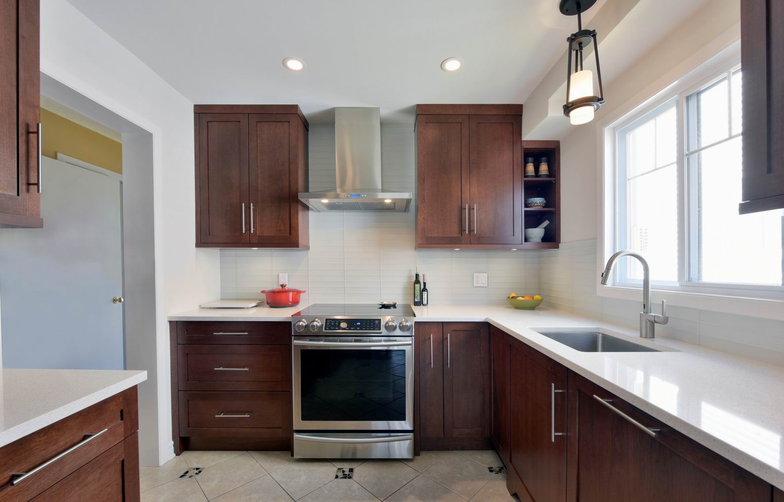
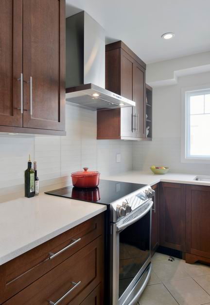
It took our Director of Design, Chuck Mills, a long time to get around to redoing his own kitchen — much like that old saying about the cobbler being too busy to make shoes for his own children — but when he finally got to it, the result was a small kitchen design that packs a punch and is now up for an award at this month’s Housing Design Awards!
The original space was small, dark and lacked both counter space and storage, he says. So the goals for the new kitchen were to reconfigure appliance locations, create a large counter work space, add versatile storage and brighten the room with new lighting that uses high intensity LED task and under-counter lights.
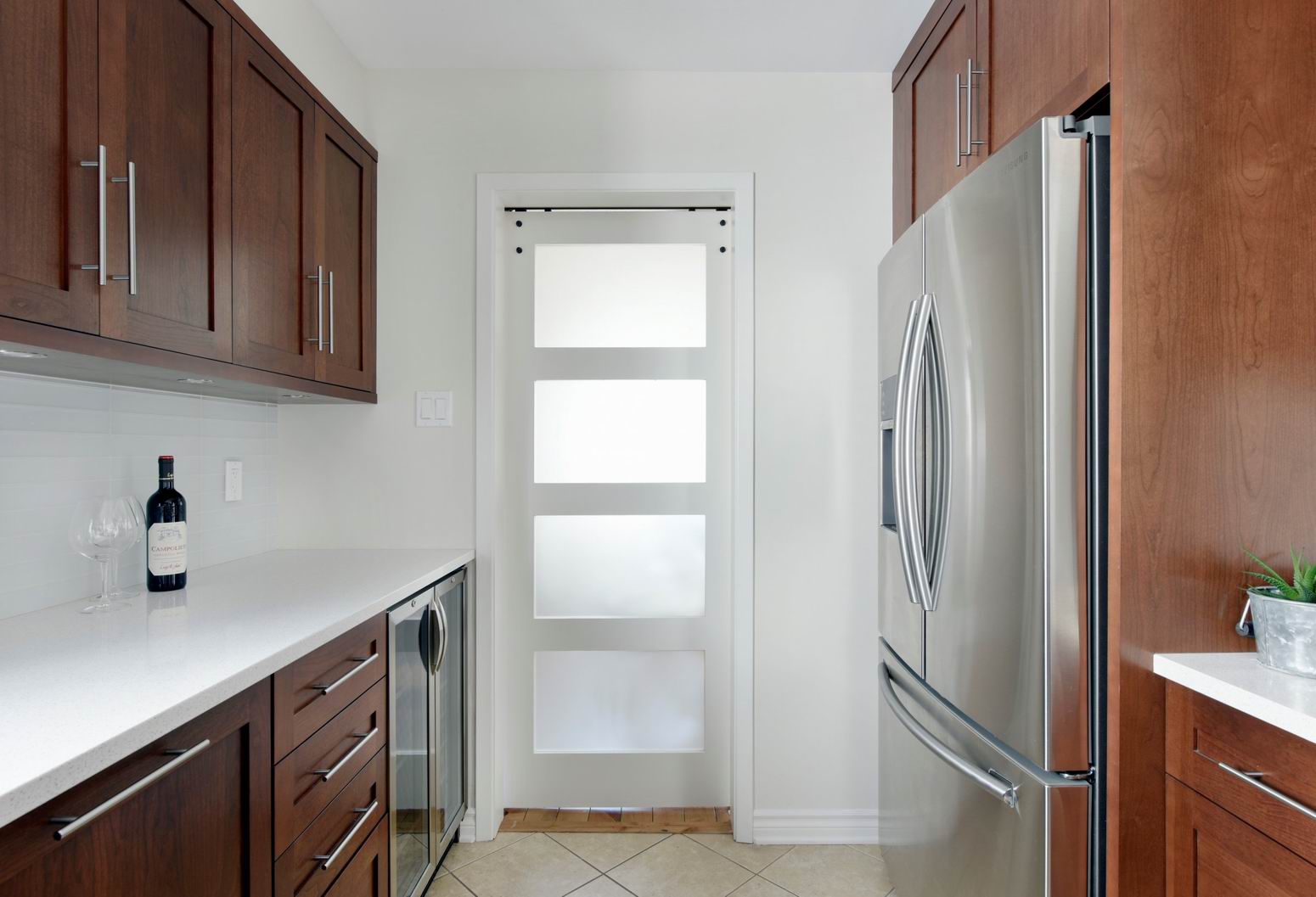
The reorganized space meant there was also room to add a wine fridge and glassware storage for this wine enthusiast.
The project has been nominated in the Greater Ottawa Home Builders’ Association awards for Custom Kitchen (180 sq. ft. or less) – Traditional.
Rich cherry cabinets are complemented by Cambria Cardiff Cream quartz and a stacked (and light) linear glass backsplash tile to make the space feel bright.
Shaker doors and decorative toe kicks accentuate the traditional style of the space and draw your eye down to the warm travertine floor, complete with dark accent mosaics that pull all the finishes together.
A large, single undermount sink with high-end, no-touch faucet is positioned perfectly under the window and accented with a traditional pendant light, inviting you to enjoy the view of the outdoors while in the kitchen.
And a built-in custom shelf by the upper cabinets beside the window allows for a display area so that the minimal counter space can be completely open for food prep.
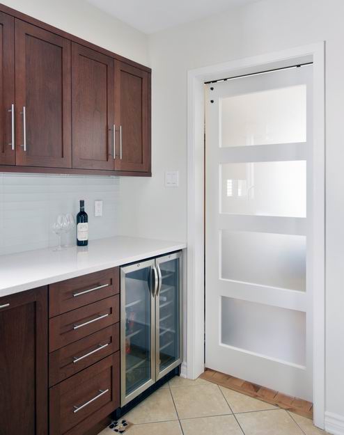 A thoughtful layout combined with helpful cabinet accessories meant there was room for a wine fridge close to the dining room for easy access. Entry to the dining room is provided by a sliding barn door that runs on a traditional black iron track and features frosted glass panels that let light flow freely between the spaces.
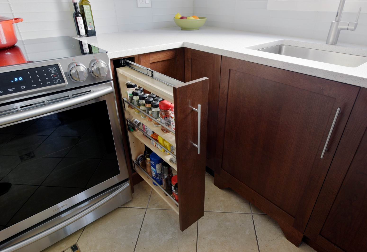 Functional storage is a must in any kitchen and this space delivers: with spice pull-outs; garbage bin pull-outs; and a handy corner storage system, everything a cook could need is at their fingertips.
To enhance the traditional feel of the space, modern appliances like the dishwasher (not shown) are integrated into the cabinetry with a matching cherry shaker door panel. This seamless look blends the appliances into the kitchen, allowing the chimney-style hood fan and full height cabinets to act as a focal point for the space.
A counter-depth fridge helps the room feel spacious without sacrificing storage. Where the fridge now stands used to be a desk space. This was not needed, so it was removed to reposition the fridge and allow more counter space on the opposite side.
Before: The original space was small, dark and lacked both counter space and storage.

