Sure, it’s what on the inside that counts, but when it comes to presenting your home’s face to the world, first impressions can say a lot. Are you putting your best face forward?


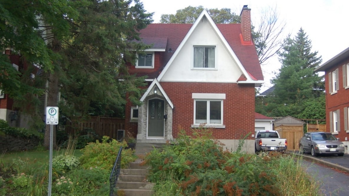
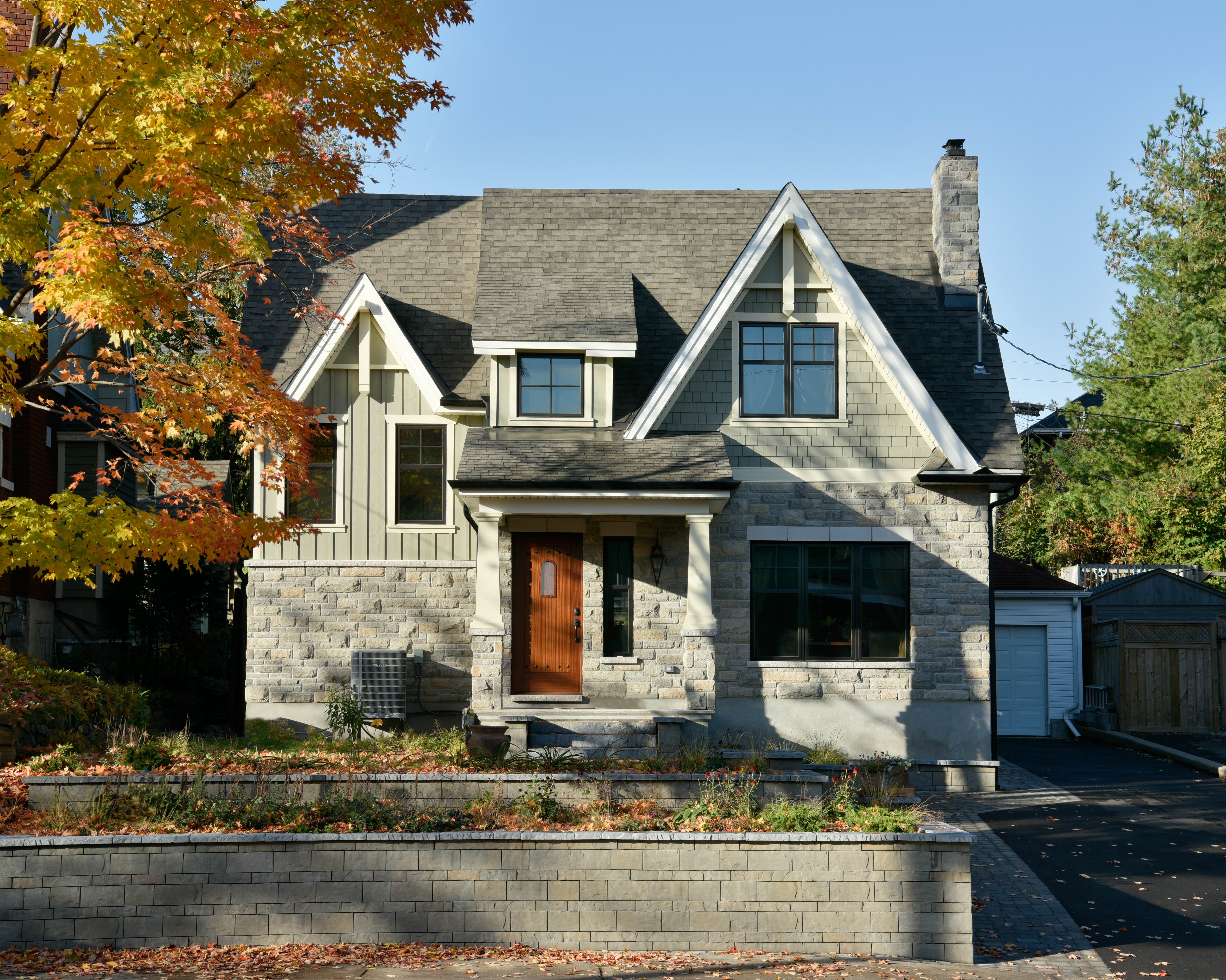
Although cute and tidy, this Westboro two-storey was dated and lacked presence before it was transformed into an award-winning stylish and classy Arts & Crafts-themed home. Changing the brick for a classic grey stone and swapping the siding for cedar shakes gives the façade an understated elegance that manages to both blend in with its streetscape and stand out.
While the addition to the side and rear certainly adds balance, the front entrance has become a focal point that welcomes visitors in, thanks to the distinctive wooden door and expanded porch with beefy columns. Updated windows, neatly trimmed in black, add a crisp finish.
And overgrown landscaping was replaced with terraced retaining walls for a clean look that softens the division between the house and the street.
Added all together, the changes create a cohesive look that’s warm, welcoming and speaks to the pride of ownership felt by the owners.
Click here to see more of this home.
Plus, Amsted President Steve Barkhouse talks curb appeal with CTV’s Leanne Cusack in this video.
